Data Visualization
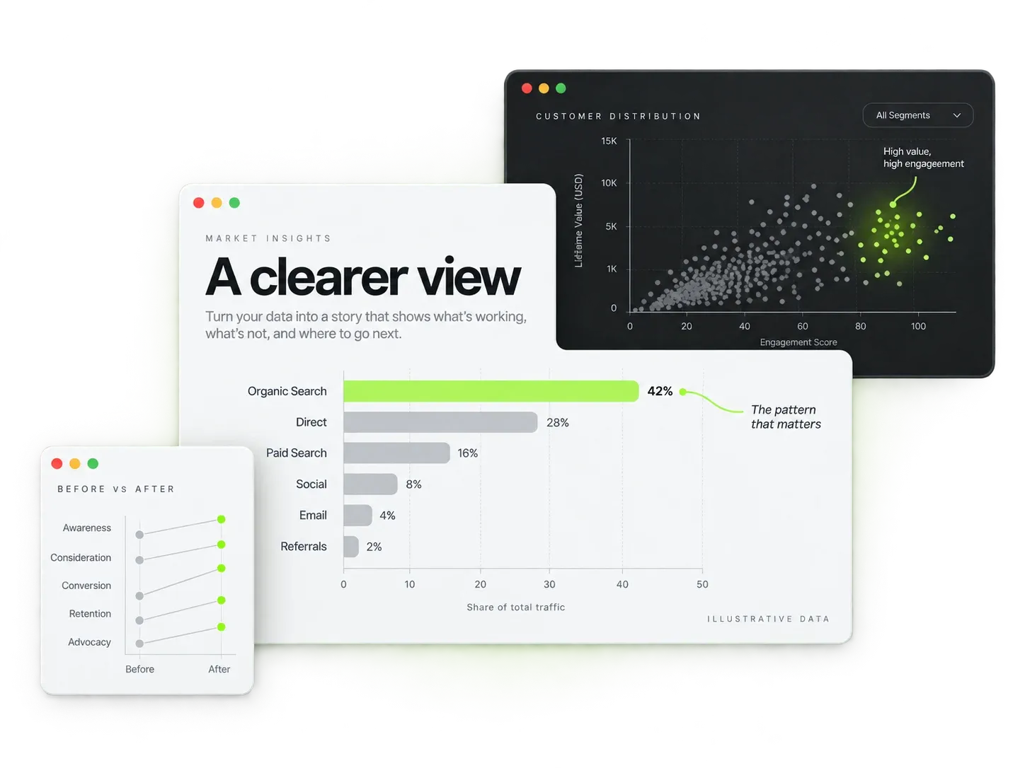
Charts that change minds.
We design interactive charts, dashboards and infographics that make complex data obvious in seconds. For your team or your investors: your numbers finally look as sharp as they are.
A useful visualization starts with a question and a clear audience. We review the data, identify what it can support, and select charts that make the comparison or trend understandable. Definitions, units, time periods, uncertainty, and missing values are considered before choosing colors or adding interaction.
Delivery can include presentation-ready graphics or interactive web charts with agreed filters, labels, and tooltips. We check readability, color contrast, mobile behavior, and the underlying calculations, then provide exports and usage guidance. Live data connections, automated refreshes, additional formats, and future updates are defined separately so the finished visuals remain maintainable.
Built around your problems
Every line item below exists because a client once paid the price of not having it.
Understood in five seconds
Design first, decoration never. The takeaway is visible before anyone reads a label.
Interactive where it helps
Filters and drill-downs only when they answer real questions. No gimmicks hiding a weak story.
On brand, presentation-ready
Your colors, your fonts, export-ready for decks and screens. It looks like your company made it, because you did.
Live or static
Connected to live data for ongoing use, or a polished one-off for a board meeting. Both get the same care.
Any format
Web dashboards, slide decks, PDFs, embeds for your site. The same visual language across all of them.
Templates that stick around
Reusable chart templates and a style guide, so your team's next report matches without hiring us again.
Our stack
Pick a plan
Clear scopes, fixed prices. Every plan can be tailored: the quote you approve is the invoice you pay.
$600
A sharp one-off for your next meeting.
- Up to 5 charts
- Static PNG/PDF export
- Your brand colors & fonts
- One revision round
$1,000
An interactive story on the web.
- Web dashboard, up to 10 visuals
- Two revision rounds
- Embeddable on your site
- Reusable templates + style guide
$1,800
Boardroom-ready, on a deadline.
- Dashboard + deck package
- Live data connection
- Presentation-ready PDF versions
- 1-week priority delivery
$600
1-2 weeks
Final quote depends on scope: you always get a fixed price before we start, so there are no surprises.
Questions clients ask
Can you work from an Excel file?
Yes, most projects start from exactly that. Send us whatever you have; organizing it is part of the job, and we'll flag anything the data genuinely can't support.
Our data is confidential. How do you handle it?
We sign NDAs as standard, work with anonymized samples where possible, and return or delete raw files after delivery. Your data never leaves your chosen storage without a reason you approve.
Can the charts be embedded on our website?
Yes, interactive charts ship as embeddable web components that inherit your site's fonts and colors, so they look native wherever they land.
How many revision rounds are included?
Two structured rounds are built into every quote (after the story sketch and after the first build). Small tweaks after that are usually just absorbed; we're not counting pixels.
LET’S WORK TOGETHER
Ready to get started?
Tell us about your data visualization project; we reply within a day.